
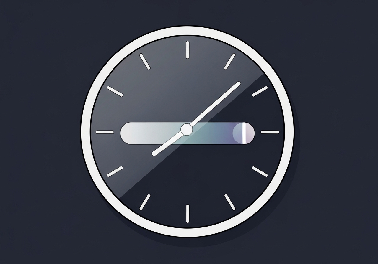
Apple released iOS 26.2 beta 1 to developers on November 4, 2025, and it refines the Liquid Glass Lock Screen options by introducing a dedicated transparency slider for the clock. The change follows iOS 26.1’s systemwide Liquid Glass toggle, which offered only Clear and Tinted presets. In 26.2, the new slider—found in the Wallpaper edit screen after tapping the clock—lets users push the Lock Screen time to much more transparent or much more opaque extremes while keeping support across different font choices. The update arrives in the developer beta channel and remains subject to change before any public release.
Key takeaways
- iOS 26.2 beta 1 was released to developers on November 4, 2025, and updates the Liquid Glass Lock Screen controls.
- The new control is a continuous transparency slider inside Wallpaper editing after tapping the clock, replacing the limited two-option toggle from 26.1 for the Lock Screen.
- The slider affects all available Lock Screen font choices for transparency, though clock resizing still works only with the default font.
- Users can now make the time significantly more transparent or markedly more opaque compared with prior iOS 26 builds.
- The change is currently in developer beta and may be tweaked or extended (for example, adding resizing to other fonts) in later betas.
- 26.1 introduced a systemwide Liquid Glass toggle (Clear/Tinted); 26.2 adds granular control specifically for Lock Screen clock transparency.
Background
Apple’s Liquid Glass aesthetic has been a multi-release refinement within iOS 26, aiming to give users subtler visual depth and translucency across system surfaces. The design motif surfaced earlier in the beta cycle and has been exposed to users as both global settings and per-element adjustments. iOS 26.1 added a simple Settings toggle to shift Liquid Glass globally between Clear and Tinted modes, a binary choice intended for quick changes. Developers and power users have requested finer-grained controls so individual elements—like the Lock Screen clock—can be dialed in without affecting systemwide appearance.
Historically, Apple has iterated on visual customization in stages: an initial rollout of a motif, followed by incremental user-facing controls and then more precise adjustments in subsequent betas. Stakeholders include everyday users who prize personalization, accessibility advocates concerned about contrast and legibility, and third-party app makers assessing how Lock Screen variants affect glanceable information. With iOS betas, changes first appear to developers and testers before Apple decides whether to ship them to the broader public in a stable release.
Main event
In iOS 26.2 beta 1 the Liquid Glass control for the Lock Screen clock becomes a true slider, located in the Wallpaper editing screen after you tap the clock element. Previously, users could influence the Liquid Glass look either systemwide via the 26.1 Clear/Tinted toggle or use earlier, less impactful per-element options; the new slider provides a continuous range from very transparent to very opaque. The slider applies to the displayed time across different font options, allowing transparency adjustments for serif, sans, and stylized Lock Screen fonts.
Practical effects are visible at extremes: pushing the slider toward greater transparency makes the numerals blend more with the background wallpaper, increasing the see-through effect; moving it toward opacity yields a stronger foreground clock presence. According to developer testers, the visual difference between the new extremes in 26.2 is substantially larger than in prior 26.x betas. The slider’s presence is limited to clock transparency control—other Liquid Glass attributes may still be governed by system settings.
One remaining limitation: Apple currently allows clock resizing only when the default font is selected. That restriction means users who prefer a nondefault font can adjust transparency but not clock scale; some testers hope future betas will add resizing for additional fonts. As with all beta features, Apple may expand, restrict, or refine these controls before the public release depending on feedback and internal decisions.
Analysis & implications
The addition of a transparency slider signals Apple’s cautious move toward more granular personalization without fracturing the overall visual language of iOS. For many users, the slider will permit subtle tuning that improves wallpaper visibility or enhances legibility depending on background imagery. That flexibility also raises accessibility considerations: very transparent clocks can reduce contrast and make time harder to read for users with vision challenges. Apple will need to balance aesthetic freedom with built-in guardrails—such as minimum contrast thresholds—to preserve usability.
From a product strategy perspective, enabling per-element sliders rather than only systemwide toggles allows Apple to experiment incrementally. It gives designers and engineers a way to observe real-world usage patterns within the beta population before committing to systemwide changes. If analytics and feedback show broad adoption without accessibility regressions, the approach could expand to other interface elements in later releases.
For the Lock Screen ecosystem—widgets, notifications, and glanceable data—the slider introduces variability that app and widget designers should consider. Text and icons layered with a highly transparent clock may need alternate contrast behaviors or adaptive styling. Third-party developers may update designs or employ dynamic contrast APIs when Apple releases the final version.
Comparison & data
| iOS version | Liquid Glass control type | Lock Screen clock effects |
|---|---|---|
| iOS 26.1 | Systemwide toggle (Clear / Tinted) | Binary look; limited per-element impact |
| iOS 26.2 beta 1 | Per-element transparency slider (clock) | Continuous transparency range; larger visual extremes |
The table highlights the shift from a binary global setting in 26.1 to a granular, element-specific slider in 26.2. That change widens the range of possible appearances: testers report noticeably larger visual differences at slider endpoints compared with prior betas. Because resizing remains tied to the default font, the practical customization surface is still partially constrained.
Reactions & quotes
“iOS 26.2 beta 1 updates the Liquid Glass slider for customizing the Lock Screen’s clock,”
9to5Mac (technology news)
The 9to5Mac write-up called out the wider transparency range and the slider’s placement in the Wallpaper editor, noting the visual side-by-side extremes found in beta screenshots. The article positions this as a continuation of Apple’s incremental customization work begun earlier in the iOS 26 cycle.
“Available for developers,”
Apple Developer (official beta release channel)
Apple’s developer channel marks the build as a developer beta; that designation means the feature is intended for testing and may be modified before a public rollout. Developers and testers are encouraged to report issues and feedback through Apple’s usual beta mechanisms.
Unconfirmed
- Whether Apple will add clock resizing for nondefault fonts in later iOS 26.2 betas remains unconfirmed.
- The exact timeline for a public release of iOS 26.2 and whether the slider’s behavior will change before release have not been confirmed.
- Any planned accessibility guardrails (for example, automatic minimum contrast enforcement) related to the slider are not detailed in the beta notes.
Bottom line
iOS 26.2 beta 1 introduces a tangible customization upgrade for the Lock Screen by turning Liquid Glass clock control into a continuous transparency slider. That change gives users and developers new options to tailor the time display’s visual weight, but it also reintroduces accessibility trade-offs that Apple should address before a wide release. For most users, the slider will be a welcome tool to fine-tune Lock Screen aesthetics without altering systemwide appearance.
Developers and designers should test common wallpaper and widget combinations against the new extremes to ensure readability and consistency. Keep an eye on subsequent betas for possible expansion of resizing to other fonts or the addition of accessibility constraints; the feature is still in developer testing and may evolve before the public update.
Sources
- 9to5Mac (technology news)
- Apple Developer (official developer release channel)