
On Dec. 20, 2025, reports show YouTube Music is moving toward a new Now Playing screen on Android and iOS after more than a year of trials. The candidate redesign restores distinct icons for the Song/Video switcher, rounds the progress bar and removes the playhead, and relocates Lyrics into the album/queue carousel. Google’s A/B tests — which began in November 2024 — have gradually exposed the changes to more users but the update is not yet widely rolled out. Early signs indicate the company may finalize this layout, balancing modern visuals with retained music-video access.
Key Takeaways
- YouTube Music has been experimenting with Now Playing revisions across Android and iOS for over a year, with testing traced to November 2024.
- The new design reintroduces icons for the Song and Video switcher, making that toggle more visible compared with earlier variants.
- The progress bar is rounded and no longer shows a discrete playhead; during scrubbing the progress line thickens to indicate interaction.
- The three lower tabs are simplified: the central “Up Next” tab is relabeled to show the current album, playlist, or mix, while Lyrics and Related tabs were removed from the tab row.
- Lyrics are now surfaced inside the carousel (commonly after the thumbs up/down pill), improving discoverability but shifting other UI elements.
- The Related content becomes reachable by tapping the song title rather than a dedicated tab, preserving access while reducing tab clutter.
- The redesign supports a dual-pane feel that combines controls and queue, potentially improving on-device navigation but forcing relocation of frequently used controls.
Background
YouTube Music has iteratively adjusted its Now Playing interface since the service split from YouTube’s main app and emphasized streaming-first features. Over the past several years the app has balanced music playback controls, video access, and lyric display while trying to keep common controls within reach on phones. Competition from rivals and user expectations for compact, gesture-friendly players have driven repeated UI experiments across Android and iOS builds. Google has used A/B testing extensively in the past to refine visual language and interaction patterns; this current round of experiments began in November 2024 and has continued through 2025.
Historically, YouTube Music’s Now Playing layout included a bottom tab row for Up Next, Lyrics, and Related content, plus a horizontal carousel for extras and the thumbs up/down pill. Some prior test variants removed the Song/Video label in favor of a single carousel button, which drew criticism for hiding a long-used toggle. User muscle memory and the prominence of music videos in YouTube Music’s catalog explain why a visible Song/Video switcher matters to many listeners. The redesign under review seems to aim for visual parity with the broader YouTube aesthetic while attempting to retain core music-first functionality.
Main Event
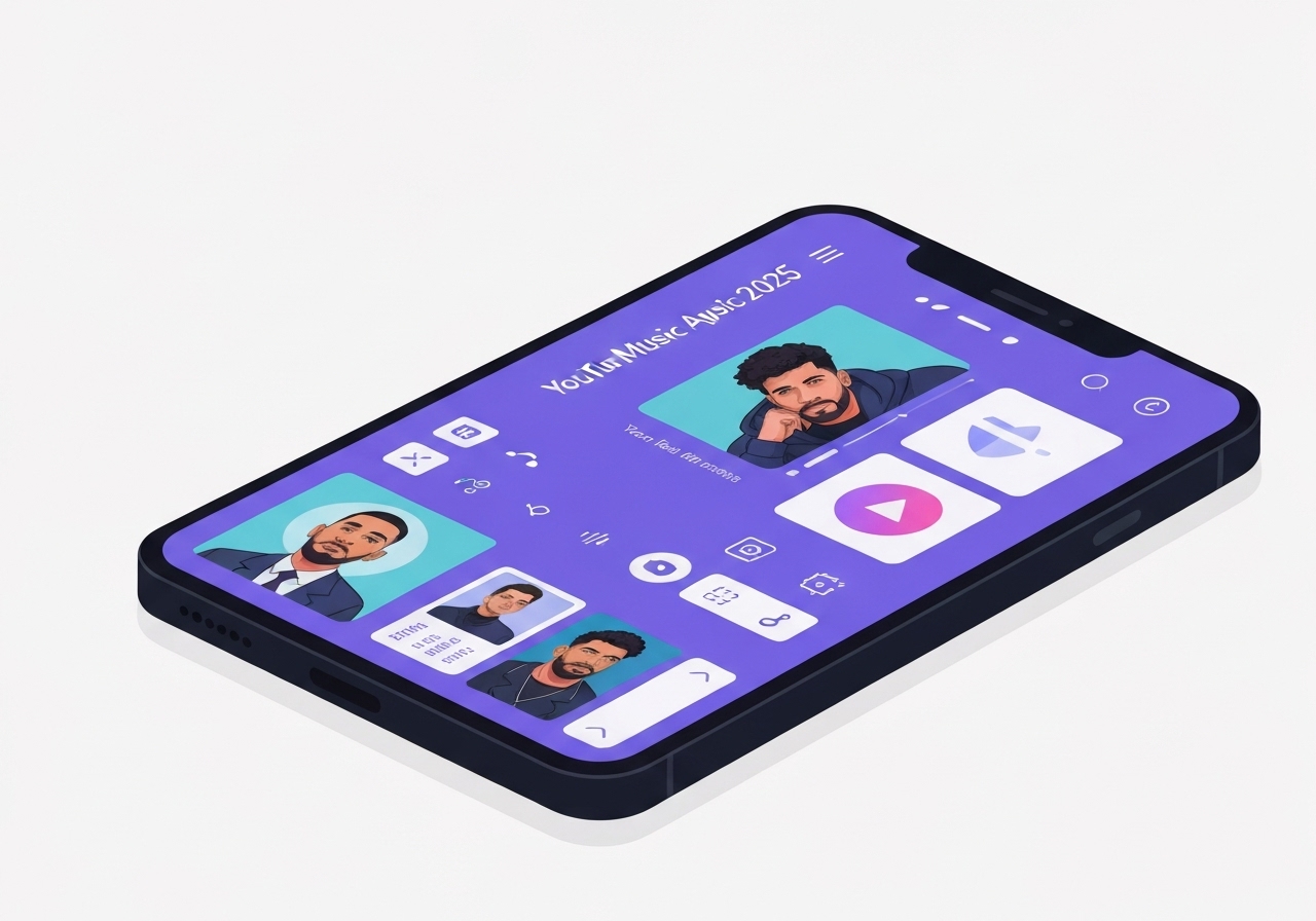
The newest candidate rebuild puts iconography back on the Song/Video toggle, making the switch explicit and easier to discover than earlier test versions that buried it in the carousel. Engineers did not reshuffle the carousel, progress bar and main transport controls broadly, but they altered the bar’s shape and behavior: the playhead dot has been removed and the scrub line rounds off, thickening during active scrubbing to show precise interaction. Observers who captured screenshots say this change aligns the app with other YouTube surfaces while simplifying on-screen chrome.
A more visible change affects the three bottom tabs. The central Up Next tab is replaced dynamically by the name of the album, playlist or mix currently playing, while the Lyrics and Related tabs are removed from the fixed tab row. According to the report, accessing Related content now requires tapping the track’s title, and Lyrics are pulled into the carousel sequence, often positioned immediately after the thumbs up/down pill. Designers appear to be trading dedicated tab space for a cleaner bottom bar and denser carousel content.
Users seeing the build reported a dual-pane feel on larger screens: playback controls and the queue occupy adjacent vertical space, enabling quicker queue management without switching screens. That arrangement reduces taps for common tasks but forces other commonly used features to migrate into the carousel or under the song title. The update is rolling out incrementally; multiple testers have reported glimpses over the past days, but the change is not yet widely available to the full user base.
Analysis & Implications
Restoring explicit icons for Song and Video respects long-standing user habits and preserves the prominence of music videos in YouTube Music’s proposition. Removing dedicated tabs in favor of contextual access reduces visual clutter but raises discoverability issues for less-frequent features — for example, users who habitually open the Lyrics tab might need to learn the new carousel position or tap patterns. Google’s choice suggests a prioritization of a streamlined visual hierarchy and a move toward composable, context-driven controls rather than fixed navigation targets.
Technically, replacing a discrete playhead with a rounded bar and scrub-thickening is a modest interaction simplification that reduces on-screen noise and may be more robust across different device sizes. It also signals alignment with YouTube’s wider UI language, easing cross-app familiarity. Product-wise, relocating Lyrics into the carousel acknowledges its high usage but also forces trade-offs: the carousel has limited slots and often hosts album art, action pills, and recommendations, so design decisions about position matter for discoverability metrics.
For power users who rely on Up Next as a constant overview, renaming the middle tab to display the current container (album/playlist/mix) could be a subtle improvement, as it conveys context at a glance. However, shifting Related behind the title tap may reduce casual exploration unless the tappable affordance is made visually obvious. From a rollout perspective, A/B testing that began in November 2024 allows Google to measure engagement, retention and search behavior changes before committing broadly.
Comparison & Data
| Element | Stable UI | Candidate Redesign |
|---|---|---|
| Song/Video switcher | Label/button in bottom carousel or button | Distinct icons for Song and Video |
| Progress bar | Linear bar with playhead dot | Rounded bar without playhead; thicker during scrubbing |
| Bottom tabs | Up Next, Lyrics, Related | Album/Playlist/Mix (center), Lyrics removed, Related moved under title |
| Lyrics location | Dedicated tab | Carousel item (often after thumbs pill) |
The table above summarizes the visible differences between the current stable interface and the reported candidate redesign. Though numerically simple, these changes affect interaction flow: for example, collapsing three tabs into one visible center slot reduces persistent targets from three to one, which can decrease immediate reachability for some features but lowers visual complexity. Designers will likely monitor click-through rates on carousel positions and title taps to decide whether the trade-offs justify a full rollout.
Reactions & Quotes
Industry coverage and tester reports have been the primary public signals about the redesign; no broad official statement has been released yet. Below are representative quotes from coverage and on-device reports with surrounding context.
“More people have seen this redesign, but it’s not yet widely rolled out.”
9to5Google (technology news)
This summarizes the current distribution state: testers and early viewers have intermittently encountered the candidate layout, but a broad rollout to all devices has not been confirmed.
“Lyrics functionality is being moved into the carousel, sometimes placed immediately after the thumbs up/down pill.”
9to5Google (technology news)
That observation highlights a key interaction change — lyrics remain present and searchable but sit in a different UI locus, which affects how quickly users access them relative to the prior dedicated tab.
Unconfirmed
- There is no official Google statement confirming a full rollout schedule or a final decision on this candidate design.
- It is unverified whether the Lyrics carousel position will be consistent across all devices or localized builds.
- No firm metrics have been released to show how the redesign affects engagement, retention, or lyric discovery rates.
Bottom Line
The candidate Now Playing redesign is a clear attempt to modernize YouTube Music’s player while retaining critical music-video access and high-usage features like Lyrics. By restoring explicit Song/Video icons and simplifying the bottom tab row, Google appears to be balancing visual clarity with functional continuity. However, moving features into the carousel and behind title taps introduces discoverability trade-offs that Google will need to measure through continued A/B testing.
For users, the change could mean slightly fewer persistent targets but a cleaner screen and a more consistent look across YouTube apps; for power users, it may require adapting habitual taps. Because the test has been visible to more users only recently and began in November 2024, observers should expect additional tweaks before a broad release and should look for an official update from Google for confirmation.
Sources
- 9to5Google — technology news report covering the redesign and tester screenshots (media/tech journalism)