
Lead
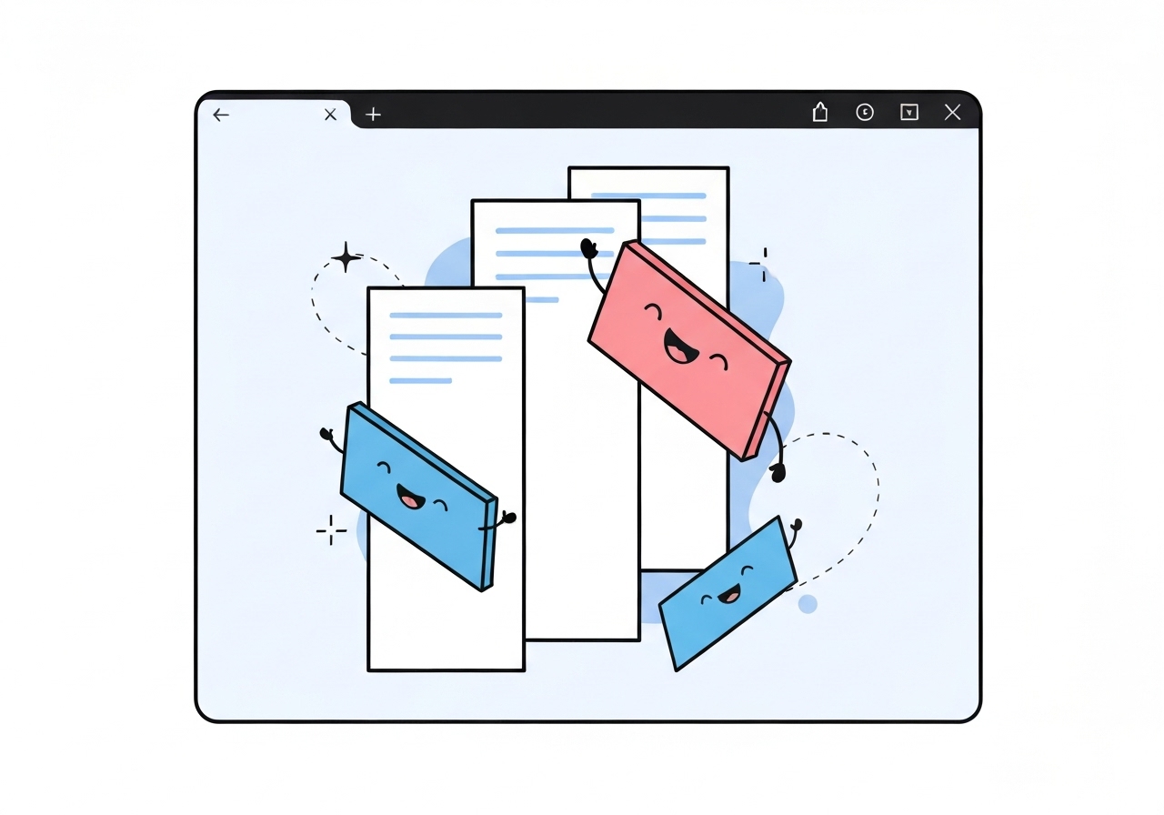
Google has enabled a long‑requested vertical tabs option in the latest Chrome Canary build for desktop, allowing users to move tab thumbnails into a side rail. The toggle appears when you right‑click the horizontal tab bar and offers a corresponding “Show tabs at the top” setting to return to the conventional layout. The sidebar places Tab Search at the top and keeps Tab Groups and the new‑tab button toward the bottom. The implementation is functional in Canary but not yet as refined as rival browsers’ versions.
Key Takeaways
- Vertical tabs are available now in the latest Chrome Canary for desktop; users enable it by right‑clicking the horizontal tab bar.
- The activation menu item reads “Show tabs to the side,” while the reverse command is “Show tabs at the top.”
- Tab Search sits at the top of the new sidebar; Tab Groups and the + new‑tab control appear at the bottom.
- Browsers such as Vivaldi, Edge, Brave and some Firefox configurations have offered vertical tabs for years.
- The feature in Canary is functional but visibly less polished than competing implementations, per early reports.
- No firm timeline has been announced for a roll‑out to Chrome Beta or Stable channels.
Background
Vertical tabs have been a frequent request from power users who run many tabs and prefer a stacked, scannable list over a long horizontal row. Alternative browsers—particularly Vivaldi—built extensive sidebar tab management tools years ago, and Microsoft Edge, Brave and several Firefox extensions or builds have also supported the layout. That ecosystem history created steady user pressure for Chrome to offer a native sidebar option to improve tab navigation and reduce horizontal overflow.
Google has historically taken a conservative approach to major UI shifts in Chrome, preferring iterative testing in Canary and Beta channels before wider release. Canary builds are experimental and change frequently; features appearing there do not guarantee a rapid path to Stable. Stakeholders include everyday users, enterprise IT teams who manage Chrome at scale, and web developers who watch tab behavior for testing and UX assumptions.
Main Event
The vertical‑tabs toggle was noticed in the latest desktop Canary release and reported by technology outlets. After right‑clicking the standard tab strip, a context menu now offers “Show tabs to the side,” which moves open tabs into a vertical sidebar. The new rail stacks tabs vertically, reducing the need to cycle through long horizontal lists when dozens of tabs are open.
Once in the sidebar, users will see Tab Search at the panel’s top and a collapse/expand control for the rail. Tab Groups remain supported in the sidebar and the new‑tab (+) button is positioned near the bottom, preserving familiar management features while changing the visual layout. Returning to the horizontal arrangement is just as simple: right‑click in the sidebar and choose “Show tabs at the top.”
Early testers note that while the structure and basic functions are present, the feature lacks some polish found in other browsers—visual refinements, fluid animations and edge‑case behaviors still need work. Because the change is currently gated in Canary, Google engineers can iterate quickly based on user feedback before progressing to more stable channels.
Analysis & Implications
For regular Chrome users who juggle many tabs, a native vertical layout improves discoverability and reduces time spent hunting across a compressed horizontal strip. This addresses a long‑standing usability gap and should lower friction for workflows that rely on many open pages, such as research, trading desks, or development environments. If refined and deployed broadly, it could shift how extensions and tab managers are used in the Chrome ecosystem.
From a competitive perspective, Chrome adopting vertical tabs narrows a UI differentiation that some rival browsers have used to attract power users. That said, Chrome’s scale means even modest UI improvements can influence web standards and developer testing priorities globally. Enterprises that enforce Chrome policies will be watching compatibility and behavior under group policy before adopting any change at scale.
Technically, integrating a sidebar mode requires attention to focus management, keyboard navigation, accessibility (screen readers, ARIA roles) and performance when many tabs are present. Early Canary implementations often miss polish in these edge areas, so wider adoption will depend on Google addressing those concerns. The feature’s eventual availability on other platforms and synchronization behavior across devices remains a separate engineering question.
Comparison & Data
| Browser | Vertical Tabs |
|---|---|
| Vivaldi | Native sidebar; advanced tab controls |
| Microsoft Edge | Native vertical tabs option |
| Brave | Native vertical tabs option (Chromium‑based) |
| Firefox | Available via built‑in options or extensions depending on build |
| Chrome | Now in Canary as an experimental sidebar |
The table shows that multiple Chromium‑based browsers and Vivaldi already offered this layout, so Chrome’s Canary change aligns it with peers. Numbers on user adoption vary by audience; power‑user communities have repeatedly requested the feature in surveys and forum threads, which is likely why Google tested it in Canary.
Reactions & Quotes
“Show tabs to the side” is the new context‑menu option Canary users can select to move tabs into a vertical rail.
Windows Report (media)
Early coverage described the feature as “functional but not as polished as other browsers,” reflecting its Canary‑stage status.
Android Authority (media)
Unconfirmed
- No official Google timeline has been published for when vertical tabs will reach Chrome Beta or Stable channels.
- It is not yet confirmed whether the feature will be enabled by default or remain opt‑in when it moves beyond Canary.
- Cross‑platform parity (macOS, Linux, ChromeOS) for the sidebar and its keyboard/accessibility behaviours has not been publicly detailed.
Bottom Line
Chrome’s Canary test of vertical tabs is a notable UX upgrade that answers persistent user requests and brings Chrome closer to feature parity with competitors. While the basic experience is present—right‑click to show tabs to the side, Tab Search at the top, groups and new‑tab at the bottom—the implementation needs refinement before it can be judged production‑ready.
Users who want to try the feature can install Chrome Canary and enable the sidebar via the tab bar context menu, but should expect changes as Google iterates. Administrators and accessibility advocates should monitor upcoming releases and test the feature in staged environments before deploying it broadly.
Sources
- Android Authority (media)
- Windows Report (media — original spotting cited)
- Google Chrome Canary (official)